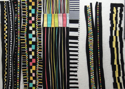
 I am making progress on Push-up #8. Here are all the bits and pieces I’ve made so far, but everything is still subject to change. I seem to be struggling a lot with this one, and I’m not sure why. Looking at all of it on the design wall at once, I realize that I have lots of negative space, but nothing much of substance. That big solid block of color either needs a few friends or it needs to be pared down considerably. I hope to squeeze in a few hours today and tomorrow to finish this off.
Comments
7 responses to “Progress on Push-up #8”
Most of this reads to me as very dark values, very textured and dark. Most of it is the same scale, which looks small. I think you want to try two things: 1) some areas that are light value, perhaps composed of medium light and light fabrics, 2) some larger scale elements. You’ve already done the hard parts, with all the twinkly small bits. The third thing you might try, after the other two ideas, is to introduce some flat versions of the colors you have. It looks like everything is glowing, high chroma; even the black looks glowing, and only the white looks flat. But this last suggestion will take this composition away from a purely graphic style, and I’m not sure that is what you want. Anyway, I love your push-ups. I learn things by looking at them.
Thanks, Connie! I was thinking the same way. I need more medium and light areas and some bigger elements. I’m going to go work on that right now.
What I see is two separate compositions Maria. Perhaps if the large white areas were broken up somewhat with color or bring in a few of the shapes from the left side, it would help bring them into the rest of the piece. I’m enjoying your journey down this path.
Yep, I think the black & white section is going to get cut up into skinny strips and spread throughout.
Maria–
I turned my laptop on it’s side and got a different impression…is vertical composition part of you original
challenge”? Fascinating, as usual…
–ed
I’m not really sure any more. I was seeing them as overall horizontal compositions with the lines/stripes going vertically. Then my son-in-law saw a printout of Push-ups 5, 6, and 7 and he immediately turned them the other way and declared he liked them better that way. He related it to reading horizontal lines of type across a vertical page.
Maria…I had not thought about it that way, but your son-in-law’s idea makes sense, but I did not have that impression of earlier works…in any case, overall they are making a great impression…
–ed