![]() I’m reposting this blog from a couple years ago because I there is so much confusion when it comes to digital image size and thought it could be helpful.
I’m reposting this blog from a couple years ago because I there is so much confusion when it comes to digital image size and thought it could be helpful.
When it comes to digital pictures, are you confused by pixels, DPI, and resolution? You’re not alone! I’m pretty much just a point-and-shoot photographer. I like to assume my end result is going to be great. After all, it looks great on the 2″ screen of my camera. But honestly, just about anything is going to look pretty good at that size. The problem is when I need to view or print out that image bigger — much bigger. Let me try to explain why.
First, a few definitions. Simply put, a pixel is just one unit or one “building block” of a single color. A pixel can’t be divided any smaller.
![]() Pixel resolution is when I start putting a bunch of those building blocks side by side and stacking them on top of each other. For instance, if I have an image that is 10 pixels wide by 10 pixels high, that would be like if I took 10 squares and lined them up in a row right next to each other, and then I stacked rows on top until it was 10 rows high. In this illustration, I’ve superimposed a 10 x 10 grid over the image to simulate the pixels.
Pixel resolution is when I start putting a bunch of those building blocks side by side and stacking them on top of each other. For instance, if I have an image that is 10 pixels wide by 10 pixels high, that would be like if I took 10 squares and lined them up in a row right next to each other, and then I stacked rows on top until it was 10 rows high. In this illustration, I’ve superimposed a 10 x 10 grid over the image to simulate the pixels.
This next diagram illustrates why pixels are important.
![]()
As you can see, more pixels mean I have more information to work with. More information means I have a lot more detail. Curves will be smoother. Lines and edges will be clearer. Compare the 10 x 10 image above with the 25 x 25 image. Immediately the circles become more apparent because there are a lot more pixels that are being used to describe those circles, but the edges are still jagged. The 50 x 50 image is even more clear, and so on. When you have more pixels, the image quality will be better. If you’re using digital images to create quilts, in most cases, you will do yourself huge favor by using a high quality image that is made up of lot of pixels.
As a side note, did you notice how some of the pixels in the images above are different tonal values? That’s called anti-aliasing. It’s a way to make the jagged edges seem smoother by placing an “in between” color along the edges.
![]() The left side of this diagram shows the continuous curved shape with a 10 x 10 grid superimposed over it. Since pixels can’t be divided into smaller units, the right side shows how that curved shape would be interpreted if it was converted into an image that was 10 pixels by 10 pixels.
The left side of this diagram shows the continuous curved shape with a 10 x 10 grid superimposed over it. Since pixels can’t be divided into smaller units, the right side shows how that curved shape would be interpreted if it was converted into an image that was 10 pixels by 10 pixels.
![]() So, where the curved edge would have gone across one of the pixels, it puts in a value that is a mix of the white and the purple. The square marked “1A” has more white than purple, so in “1B” it is interpreted as a light purple value. In the square marked “2A”, there is more purple than white, so the “2B” square is interpreted as a medium-dark value.
So, where the curved edge would have gone across one of the pixels, it puts in a value that is a mix of the white and the purple. The square marked “1A” has more white than purple, so in “1B” it is interpreted as a light purple value. In the square marked “2A”, there is more purple than white, so the “2B” square is interpreted as a medium-dark value.
Another confusing term is DPI, or dots per inch. For our purposes, there are two issues to consider.
One consideration is how an image appears on a computer monitor. In the case of monitors, it is more accurate to call this pixels per inch or PPI. While there are variations and user preferences, let’s assume that an average computer monitor displays 72 pixels per inch. So if you have a picture that is 400 pixels by 600 pixels, that image would be about 5-1/2″ wide by 8-1/3″ high on the computer screen (400 divided by 72 and 600 divided by 72).
The second consideration is how an image would be printed. For a printer, dots per inch literally refers to how many tiny dots of ink is printed in one inch. If a printer is set to print 300 dots per inch, then an image that is 400 pixels by 600 pixels will be 1-1/3″ by 2″ when printed (when printed at 100%). However, if the printer is set to print 600 dots per inch, then that same image will be only half that size when printed at 100%.
For quilters using the technique that I teach in my Making Faces DVD, they need to print out their image 8″ wide. If their image is only 400 pixels wide, then that means there are only 50 pixels that can be printed per inch (400 divided by 8). That is very low resolution for a printed image. It can’t provide a lot of valuable details.
Here’s another way to look at it.
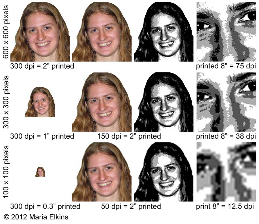
In the first column, I have three versions of the same image. The first image is 600 x 600 pixels, the second is 300 x 300 pixels, and the last is 100 x 100 pixels. If each of these is printed on a 300 dpi printer at 100%, the first image would be 2″ square, the second would be 1″ square, and the last would only be 1/3″ square.
The second column shows what happens if I want to force each of those images to be 2″ when printed out on a 300 dpi printer. For the 600 x 600 image, each pixel can be represented by just one dot of ink. For the 300 x 300 image, each pixel would have to be printed twice as big to print the image so it is 2″ by 2″, so it would take four dots (2 wide by 2 high) of ink to represent each digital pixel. For the 100 x 100 image, it would take 36 drops of ink (6 wide by 6 high) to represent each pixel so that the printed image is 2″ by 2″. Can you see why it gets so distorted when you have a low resolution image?
That’s not too bad so far, but for my “Making Faces” technique, we are printing out our images 8″ wide. That’s what the right hand column shows. When a 600 x 600 pixel image is printed 8″ wide, you have 75 pixels that get stretched out over each inch, but when you get down to the 100 x 100 pixel image, there are only 12.5 pixels that you are trying to stretch over each inch. Yikes! Not good.
So much detail gets lost when you are trying to work with low resolution images! As much as you may like one of those images, unless you are very confident with your artistic abilities, it may very well be worth your while to search for a higher resolution image to work with. It may just save you a lot of headache, and you will probably like your end result much better.