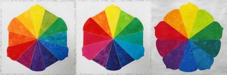
The first color wheel in the photo above is the one that is most familiar. It uses the red-yellow-blue primaries. The center color wheel is use cyan-magenta-yellow as primaries, and it is often used by dyers. Both of these color wheels are based on color mixing principles.
The color wheel on the right is the Munsell color wheel. That’s the one I’ve been playing with this week. It is a little bit different. It uses five principal colors: yellow, red, green, blue, and purple. The complementary colors (directly opposite on the color wheel) are based on the afterimage perceptions of each of the principal colors.
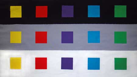
Next, I wanted to see how differently the colors looked based on the background, so I placed each of Munsell’s principal colors on black, middle gray, and white. If you were quilting in the 1990’s, you may remember that quilters often used black with jewel tones, because it makes the colors practically glow. Gray is a tricky color. Because it is middle value, a color that has a similar value can get lost. Sometimes the gray will take on the appearance of the complement where it is close to a strong color. When a color is placed on white, it loses some of its luminosity and it can appear darker.
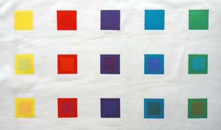
Last, I decided to explore the idea of disappearing boundaries which is discussed in Edith Anderson Feisner’s book, Color Studies. Disappearing boundaries occur when analogous colors (two colors next to each other on the color wheel) are placed next to each other. If they are the same value, or close to it, they tend to visually blend into each other. So, in the photo above, the first row are Munsell’s five principal colors. The next two rows have the principal colors with an analogous color in in the center, first with the analogous color moving clockwise and then the analogous color moving counter-clockwise. In some cases, the values between the two colors are so close, you can really see the effect very well.
For my color wheels, I used beautiful hand-dyed fabrics from Ruby Mountain Dye Works. For the samples in the last two pictures, I used Kona cottons. I could get fairly good color matches for the most part but, of course, since I am not mixing and dyeing my own fabrics there are limitations. (I have no skill to do that anyway!)
Comments
One response to “Munsell Color Wheel”
Interesantes reflexiones sobre el color.
(Interesting thoughts on the color.)