 I’ve been quiet this week because I’m trying to stay away from my computer and stay focused on sewing my new composition. I decided to play with tonal progressions a little more.
Here was my basic thought process as Push-up #2 progressed. (Forgive the poor quality of the image. I just did some quick digital editing to simulate what it might have looked like, but I didn’t want to spend a lot of time trying to make it perfect.) My initial idea was to have several zig-zaggy forms on a white background. Each “branch” would gradate from light tones on top to dark tones on the bottom (top left). Next I thought I should break up the repetition a bit by flipping one of the “branches” so just one gradated from dark on top to light on the bottom (top right).
 I had the first three columns sewn with a white background when I started wondering what it would look like if I varied the background as well, so I picked four shades of gray plus black and used those for the last five columns (left). I started sewing the columns together when I wondered what it would look like if I varied the order of the columns. I took the two darkest columns and moved them to the opposite side (right). I instantly liked that better.
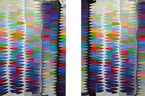
 Once I had them all sewn together, I wondered what it would look like if it was rotated 180 degrees. I think I like it with the lightest portion on top (left). This was reinforced when I was reading Color Studies (Second Edition) by Edith Anderson Feisner. She said, “We also find that our eye is most satisfied with black or dark values at the bottom and white or light values at the top.” Obviously, she is not saying this is a “rule” that every composition must follow, but I thought it was interesting that I really did like the one with the lightest values in the upper center.
To me, another interesting thing about this exercise was noticing the areas of high contrast versus the areas of low contrast. There are areas where there is a stark contrast between the figure and background, and there are several areas where the figure is nearly the same value as the background, so the figure and background visually merge. Because the value of the background is varied, the places where the tonal values merge occurs at different heights.
The other thing I enjoyed noticing, which you can’t see as well in the photograph, is how the background changes how the colors in the figures look. In her book, Feisner stated:
White weakens the luminosity of hues adjacent on the color wheel and makes them appear darker. Red is dark on white, but warm and luminous on black. We also find that middle gray or middle-valued hues are those most strongly influenced by the hues around them. A middle-value gray or neutral will make hues adjacent to it appear stronger, in fact the gray or the neutral will become tinged with the complementary of the hue. Therefore a hue surrounded by gray will seem more colorful. Light-value colors tend to expand and wash over an area while dark-value colors tend to contract and pull within themselves.
If I was just reading the book, I probably wouldn’t remember those concepts, but now I have a visual reminder. Another very good reason for me to do these “push-ups.”
Comments
5 responses to “Push-up 2 completed!”
I don’t know why, but the one on the right (in the last comparison) makes me feel underwater.
Maria, your “push-up exercises” are of great interest, especially as you analyze results and work through “what ifs”. Your discipline to “do the work” is inspiring. Thank you!
Those teach a great lesson on composition…the concepts carry across into different media…you have created some interesting examples…
Just catching up with you again.
Do you know, just today I was wondering about something Elizabeth Barton wrote that she suggests in her classes. “”I think you should do several different value sketches before you begin – practice trying different value patterns”. ”
and my thinking about it came to this…how do you do a value sketch in the first place? How do you practice value patterns? what would it look like?
and here I come to find that you are doing just that! Amazing how when you start really becoming focused, the answers to your questions are brought your way.
Thanks for sharing the journey.
Sandy in the UK
I love it when that happens! She was also encouraging people to experiment in her last blog.
As far as value studies, one other thing you can do is to create a composition in just black, white and gray. When that is pleasing to you, then start replacing the black, white, and gray with similar values. If the neutral composition was successful, it is very likely that the colored one will be, too.