I wanted to look at all of the Push-up series at once, so I thought I would do a short blog on them. For those who are new to my blog, my idea of a “push-up” is taking the opportunity to explore an idea without expecting to create a masterpiece. It is a relaxed approach. It’s low risk. I don’t worry about failure. I just try to enjoy the process. Truthfully, I still battle the fear of failure regularly, but I my hope is that I can just relax and

So, here are my push-ups so far.
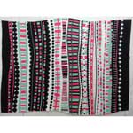
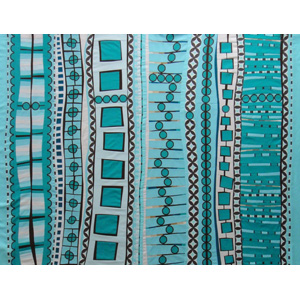
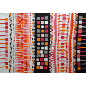

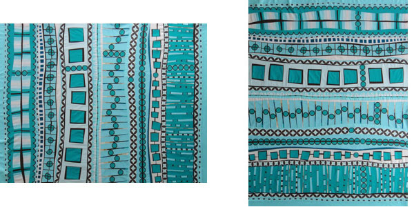
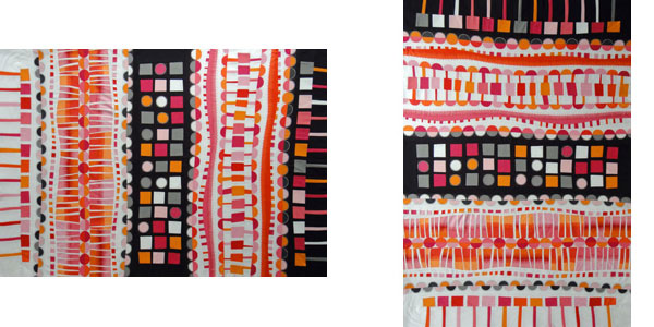
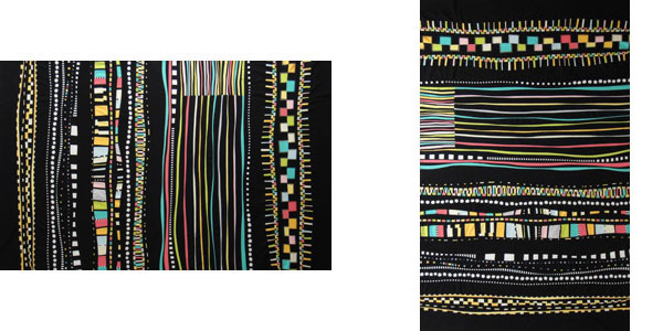
I had an interesting discussion with one of my son-in-laws several weeks ago. I had printed out several of the images these quilts on a single sheet of paper. I was thinking of these quilts as horizontal quilts. Not knowing this, he picked up the sheet and held it vertically, and announced that he liked them better that way. (To me, when presented vertically, the lines remind me of text on a page.) So that conversation got me thinking, and I thought I would show both options to you side-by-side.
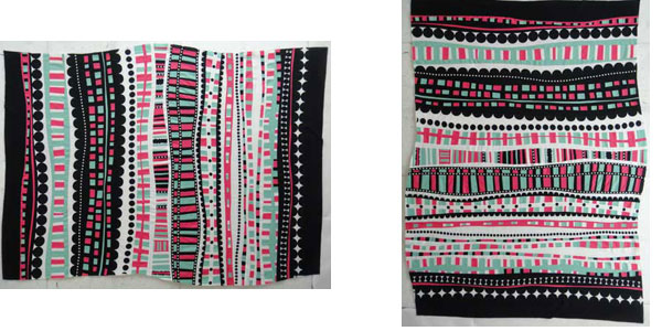
Which do you prefer?
Comments
11 responses to “Push-up Series so far”
Hi Maria, it’s been fun following all your pushups, thank you for posting!
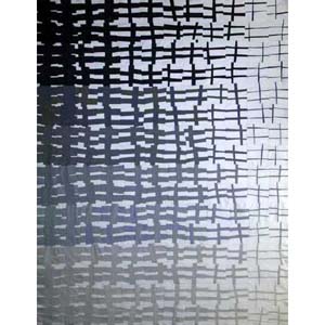
I like #5 best horizontal as I don’t like the curve on the side, while it looks in place at the top.
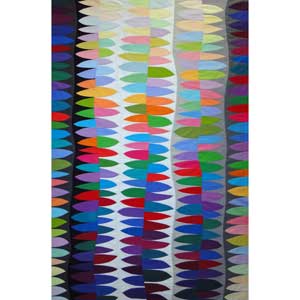
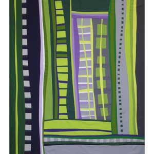
#6, 7 and 8 I do like vertical.
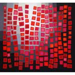
From all your pushups I adore #1 and 3, they don’t look like practice pieces but likw planned works. The red is sooo good, with the light drawing your eye to the curve in the top, fantastic!
Thank you for all your explanations while working on these.
Ok, I look at the horizontal one and feel the ‘flow’ vertically of the design. On the vertical versions, it just feels more like a rag rug.(I like them either way, but this is my first impression.) Another question: Have you quilted these yet, or are they just pieced? And what are your plans for your pushups? Lining an exercise room with them? I love to look at them. They are stimulating!
Plans? Hahaha! The plan was just to play. The only one that is quilted so far is #2, and I wasn’t necessarily pleased with the end result. Need to work on simplifying 🙂
Funny how your unplanned quilts can look so fabulous! Hope some day I can do that! I like the vertical better, but I would – that’s how I look at the world for some reason.
I wonder if I made these horizontal because that is the way my design “wall” (i.e., my storage cupboard doors) is oriented. I basically just filled the design space.
If you think about energy contained in lines, there tends to be more energy in a vertical line, whereas a horizontal line makes us think of horizons, flat, relaxed, etc. So I guess with changing your orientation, you are changing the energy of your piece. So do you want to give your viewer something more peaceful or something more energetic to view?
Excellent point! Thanks for reminding me of that!
Ditto to ms lottie. Although I do like the first 2 vertical as they remind me of train tracks 🙂 so they look like they are going somewhere. (It must be my visual spacial brain)
I like books and words and lines of text, so I like the vertical orientation 🙂 I’m also a fan of “bed” quilts so I think the vertical makes me picture the quilts on beds. Therefore, I like the vertical versions 🙂
I absolutely love #6 Teal Trials and #8 A.D.D.!! What are your plans for these now? Do you consider them done even if not quilted ;)?
No, I don’t think they are done yet. To really understand these, I think I must eventually quilt them. I have a hard time really evaluating them. I can look at other people’s work and know if I think they are working or not, but I just don’t seem to be able to do the same for my own work. (For instance, I honestly did not know if people would like Windblown or not. It ends up, “they” did, but I was truly surprised.) I am utterly in the dark in determining if these are any “good” or not.
Both are right, but I think I prefer them vertically as well, perhaps you should try to turn them again to see which way you like them best. #7 and 8 might look better if they’re turned 180 degrees. You’ll have the darker side of 8 on the left and the short lines of 8 at the bottom. I was once told that a good composition works from all sides.