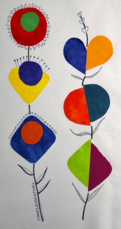
 Here’s another quick color doodle, this time using complementary colors. It’s fun to try to create in a different style for me. I’m usually so literal. I’m actually don’t do much doodling, sketching, or drawing. When I was in high school I filled lots of sketchbooks, and I loved my drawing classes in college, but I never really got in the habit of doing it on my own. I don’t write journals either. Do you think the two activities are related? I always thought I didn’t write journals because I’m not very introspective. I think my thinking is too concrete.
I read a comment on another blog that was characterizing “modern quilts” as lots of white, bright colors, and free cutting. I thought that was a really good observation, and it made me return to my thoughts about color trends. Here are some of the color trends I remember. Most of these observations are based on specific items, clothing, or fabric that I personally owned or experienced.
Early 1970’s – avocado green, harvest gold, burnt orange
Late 1970’s – navy, burgundy, and cream; earth tones
Early 1980’s – lavender and teal
Late 1980’s – dusty blue, dusty pink, dusty green
1990’s – jewel tones
2000’s – batiks
2010’s – whites plus brights
What can you add or correct based on what you remember?