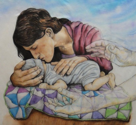
 Backgrounds. I’ve never liked them. Like I said before, backgrounds are boring. Maybe it’s because I spent so many years just drawing with pencil or Conté crayons, concentrating on just the main image. Somehow that seems fine for a simple drawing, but it doesn’t work so well on painted images.
So, I always end up with the same dilemma. I never quite know how to how to deal with the background, especially in a piece like this. The main image is completely painted, but if I do a watercolor wash for the background, I risk having it bleed into the main image and ruining it. I probably should actually paint the background first. Why don’t I think of that in the beginning? It’s likely that I’m so impatient to start that I want to jump right in to the fun part. Ah, well. Maybe when I grow up, I’ll be able to think more maturely and do my backgrounds first — kind of like eating your vegetables first so you can have dessert later.
Comments
12 responses to “On backgrounds”
Maria, this is lovely! Just the thing. You know, if it works for you, then why tweak it?
In addition, when I was looking at “Windblown” (obviously not the first time I’ve seen it) at IQF, I thought back over all of your other quilts and what your “voice” is….part of it is the painterly way you handle your figures, but the other aspect is that all of your quilts (or rather most your quilts and certainly the most celebrated ones) have some traditional quilts somewhere in them, particularly as the background.
Well done….once again! Lisa
How about having more of a nursery wallpaper background, really faint in color so it doesn’t detract from the focus of your piece? Just a thought. Although, just a colorwashed background would be great with some of your more than awesome quilting on top of it.
LOL! I like the idea, but I’m not a miracle worker, BJ! Although, I suppose motifs could be quilted in the background.
I think having nursery wallpaper would make me too sad… We aren’t doing a nursery since odds are he wont live long enough for us to bring him home, and I think seeing more of a nursery setting in the quilt would just make me cry… 🙁 I think the idea is great – just don’t know if I could handle it… granted, its not MY quilt, so mom, you can do whatever you want. 🙂
DD#2
Yes, I think keeping the background more sky/heaven-like is better, and I’ll quilt some beautiful feather motifs lifting upward.
To me, this looks like a heaven-y sky, very much in keeping with the theme and a great ethereal juxtaposition with the earthly wood grain table and quilt. A mix of the closeness – and smallness – of the parent and child amid the vastness of God and the Universe. She wants to hold on for one last kiss but knows she must let go… Very powerful and poignant.
I think it’s beautiful as it is! Just add some great quilting in the background and it will be perfect!
Your family’s strength and faith are amazing. My heart breaks for your daughter and son in law, but I also admire them for their respect for the life God has entrusted to them. What a lovely tribute to them. I’m sure the painting will be cherished forever. God has certainly given you a gift.
I like your backgrounds. The main image should be the focal and the background just needs to…well be a background.
This is beautiful and such a strong image. You are inspiring.
I think it is beautiful as is. It is an amazing piece of work. There are no word which can decsribe what this does for me today. Thankyou for helping me see my challenges through a different perspective.
I love how the background colors show through the hands!
Just finished the Fallen Stars book and loved it. Please tell Dave he is a great storyteller. Belinda
He says thank you! I think you made his day 🙂