 I’ve been having fun with color this week. I’ll be doing a color lecture for a fairly large group of quilters in another month. A couple years ago, I made a series of 24″ square examples of the various facts I teach. That size is great for smaller groups, but I decided to create a PowerPoint presentation that I can use in conjunction to the samples for larger groups.
Playing with color is so much fun! Part of the fun is the fact that it can be unpredictable. I vividly remember picking out a soft, warm tan color to paint our Sunday school rooms at church. It was the same calm shade as a manila folder, but when it was painted on all four walls, it ended up looking like bright, Post-It note yellow. Yikes! Not what I planned. I had not taken into account how the color would bounce off the other walls and intensify. I actually had to hold a manila folder up to the wall to make sure the paint was mixed correctly. In the end, everyone decided they liked the color enough, so we didn’t repaint.
My conclusions: color is like a chameleon. It changes based on what is around it.
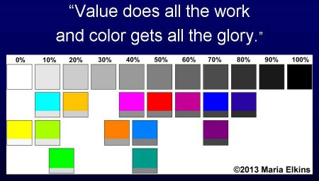
Another aspect of color that many people do not take into account is value. Have you heard the quote, “Value does all the work and color gets all the glory”?
I just finished making this chart (above) for myself showing the values of colors from the standard color wheel and the dyer’s color wheel. To make sure I got the value of each color correct, I used Photoshop Elements to convert the colors to grayscale, and then I placed them in the corresponding spot.
We quilters are often seduced by all the wonderful colors that are available to us, and we end up with mostly mid-value, high intensity colors. We often forget to consider the value of the colors we are working with. There may be contrast when it comes to hue (color), but visually the hues may all be similar tonal values and, as a result, the quilt may look somewhat “flat” and lifeless. It takes a lot of effort to disregard the actual color and consider the tonal value instead.
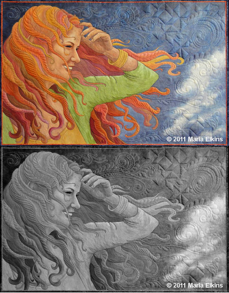
 Have you ever taken a photo of your quilt and converted it to grayscale? Here’s what “Windblown” looks like when converted to grayscale. There are parts where I relied on value contrast to accentuate the figure and other areas that are less important so I allowed the values to be similar.
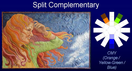
I did another thing for the Powerpoint presentation that I think will be helpful. Next to the examples of each color scheme I want to explain, I placed a small color wheel with the colors used in that quilt. I think that will help people understand the concepts better.
What questions do you have when it comes to understanding color?


Comments
5 responses to “Fun with color”
As a color lover, this post hits the spot and is right on! Wish I could attend your lecture…
Wish I could attend also! What a thoughtful, clear presentation of color concepts.
Yes, it would be fun to learn from you! I love that quote about value and color. I had not heard it before, but it was definitely a turning point in my art education when I finally understood it.
You asked about questions – here’s something that still seems to baffle me – how to deal with the “brightness” factor. There are some colors that are so neon bright that their value almost seems irrelevant. They seem to be anomalies in the “rules” of color.
While they do have value (typically a lighter value), I think you pretty much have to expect that neons will be prima donnas and steal the show. I do think that they are somewhat subdued on a white background, though.