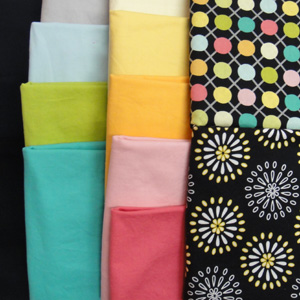
 I’m heading back to my studio for the rest of the day, but first I thought I’d show you my color palette for Push-up #8. As you can see, I’m using the fabric on the upper right as the inspiration for my color scheme. I think that’s a good way for me to branch out into using colors I wouldn’t normally choose. Stepping outside my comfort zone is good, right? Besides, these are pretty cheerful colors that will help combat the subzero temperatures we’re experiencing right now.
Comments
4 responses to “Color palette for Push-up #8”
Can’t wait to see the progress…
–ed
Love the colors and patterns here!
I certainly love these colors and the little bright squares of color in the focus fabric. This is so different for you… more geometric and less realistic. That’s the way to stretch isn’t it!?! cool…
LeeAnna Paylor
lapaylor.blogspot.com
Yes, definitely a stretch! And, some days I don’t feel very elastic!!!