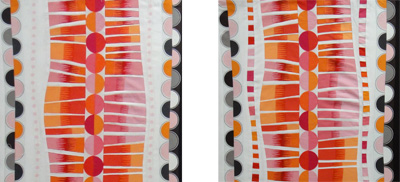
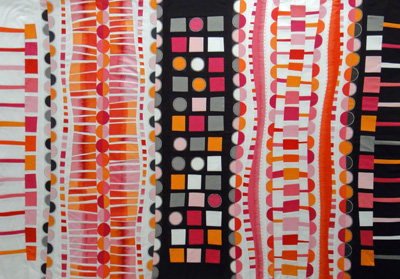
 I hung Push-up #7 on my design wall and instantly realized I would need to make a few changes. See the section on the left with the pale pink polka dots on either side of the strip-pieced section? The pale pink completely disappeared when I stood back and all I saw was too much white. I decided I needed something a little bolder. I like the look of dashed lines, so I replaced the pink polka dots with a multicolored broken line, and I like it so much better now.

Can you see the other change I made? In the left and right borders in the “before” version (see yesterday’s post), the color of the narrow stripes matched the color of the squares. Considering everything else, I thought it was too matchy-matchy, if you know what I mean, so I tore off the narrow stripes and reversed them so the colors were a little more random.
I’m ready to call it finished. Now to clean up the studio and plan Push-up #8.