 One thing I’ve learned about myself is that I need things to be organized in logical ways so my brain can process it all more easily. I started college when I was only 17, before I consciously realized this about myself. Even though I really liked my college textile art professor, I could never quite grasp the things she was trying to teach me because she taught in such a haphazard manner. Years later, it all finally clicked when I read a very organized outline of the material. Don’t you love those “Ah-ha!” moments?
For years, I’ve organized my fabric in color wheel order. A little obsessive to some, I’ll grant you, but it makes sense to me. It helps me find what I want very quickly. After my last workshop with Nancy Crow, however, I wanted to start viewing color differently.
Maybe you’ve heard the saying, “Value does all the work and color gets all the glory.” (Author unknown) I started wondering if I would work more efficiently if I organized my solid-colored Kona cottons by value. It’s a little geeky, I know, but I figured it was worth a try. Since I already had them in color wheel order, by default, you’ll see that they ended up somewhat in that same order as I sorted them by value.
So, here’s my tutorial on how to determine value. Many people use different tricks and tools to determine value. Some take photos and convert them to black and white, or some people make black and white photocopies. Others use transparent red or green overlays. I think each of these has their drawbacks and are not 100% accurate.
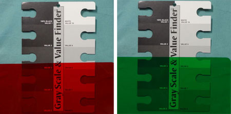
Look how different the results are when I compare the red overlay and the green overlay. If you just look at the center of the picture below, notice how different the value of the fabric looks under the red overlay versus under the green overlay? Squint your eyes, if you don’t see it right away. Doesn’t the red side look significantly darker to you? When I use the red overlay, the fabric seems closest to the value on the bottom left of the gray scale. When I use the green overlay, it seems closer to the second from the bottom on the right side of the gray scale. But it can’t be both, so which is correct?
Instead, I decided I wanted to train my eye to detect the difference. After all, when people look at my final quilt, they are not going to be using any of these devices.
In order to train myself to detect value, I use a gray scale tool. Yes, I am still using a tool initially, but the more I use it, the less I need it. A gray scale is a small piece of cardboard has ten shades ranging from pure black to pure white with eight shades of gray in between. For convenience, each value is numbered with black being 1 and white being 10. Each value has a small cut out. You can place the tool on any color, any item, any surface, and then you compare the color of the item with the different tonal values. Use the process of elimination to narrow it down. It is typically very easy to immediately eliminate the shades that are too dark or too light. Then I might get down to just two tones that are in the running as being similar to my item. I sometimes need to squint my eyes. I’m trying to determine where the color “disappears” into a particular gray tone.
When I lay my gray scale on this green fabric, I can immediately see that it is much lighter than the darkest shades, numbered 1 through 4. And, it is much darker than the lightest shades, numbered 8 through 10. I think it is equivalent to one of the shades 5, 6, or 7. After squinting my eyes and stepping back a bit, I think this particular color is closest to tonal value 6. When I take a picture and convert it to black and white, that confirms my choice.
Remember, there are only ten tonal values to choose from. Since there are an infinite number of tonal values in our fabrics, you won’t always find an exact match. Theoretically, a color could be exactly halfway between two tonal values. I just try to decide what it is closest to, knowing that it’s not an exact process.
Anyway, when I unpacked my fabric from my last Nancy Crow workshop, I knew I wanted to make note of any particular colors that I wanted to replenish. I decided to take that time to also divide it all up by tonal value. I was surprised by how fast it actually went. As I went, I used a Pentel Gel Roller for Fabric and wrote the corresponding number on the corner of each piece of fabric. That way, if I choose to keep my fabric this way, I’ll know where to put each piece I use (as long as I remember not to cut that corner off!).
Doesn’t this shelf look pretty with all of those luscious colors just waiting to be made into quilts? For comparison sake, I converted the photo to black and white. There are a few pieces on each shelf that might be out of place. I might move them around to see if they should be in the next value group. In a few instances, however, I don’t always agree with the results of a black and white photo. There are a few colors that I think read lighter or darker in the grayscale version than they do to my eye. Probably not overly important, but it’s another reason why I really prefer to train my eye to discern values.
When I was putting all these on my shelves, I put values 9 and 10 together on the top shelf and values 1 and 2 on the bottom shelf together. Those of you who think like me, might have caught on to my nefarious scheme! Look at all that empty space on those shelves. I might just need to go buy more fabric…


Comments
9 responses to “Tutorial: Using a gray scale tool”
This post is OUTSTANDING. Thank you so much for generously sharing your time and knowledge. I have just retired from teaching to come home to quilt fulltime, and I plan to get organized and productive. It is so encouraging to see a strategy like this clearly explained, as well as justified artistically. As a mathematician, organization is typically easy for me, but what appears “logical” doesn’t always lend to creative expression.
This is a terrific post. Thank you! My next question… how do you sort prints/batiks/etc.? Or do you have any?
That is great…I am in the process of getting new (more) shelving for fabric, and I need to organize all of my Black, Grey and White fabrics like that…
I can see how organizing colors that way would also help in creating contrast (or lack thereof) in using colors WITH black…
–ed
I’ve never seen your little grey scale tool — what a great device! I usually organize my fabrics and take a photo and convert to black and white to make sure the values are correct. Thanks for the tip.
Maria: great post! I sort my fabrics by color wheel, with red on the left, violet on the right, and the earth tones and gray scale on the far right. My the hand-dyes (not so many) are on the top shelf. The next three shelves (I have to shelf units, 4 feet wide each with four shelves, about 4 feet high) are the hue with light, medium, and dark (on the bottom). It works for me. And yeah, sometimes it’s a guess with the contrasty batiks. Thanks!
Estupendo artículo. Me parece una gran forma de poder organizar las telas y más si además es posible aprender a hacerlo sin necesidad de herramientas. Lo probaré. Gracias.
(Great article. Sounds like a great way to organize fabrics and more if it is also possible to learn to do without tools. I’ll try. Thank you.)
Wow! Organised like that it makes it so easy to see the tonal differences (and doesn’t it look divine?!) Interesting that your light value shelves are much fuller. Is it because you like them better so buy them more frequently, or because you have used more of your darker values so have less left?
I’m not sure. Over the past couple of years, I have made a point of collecting 1/2 to 1 yard of each color of Kona Cotton specifically so I wouldn’t unintentionally ignore colors I am not naturally drawn toward, so maybe there are just less of the darker ones available. At the same time, I have been using them, although I don’t think I’ve been using more of the darker ones. Guess I’ll just have to go shopping to remedy the issue 🙂