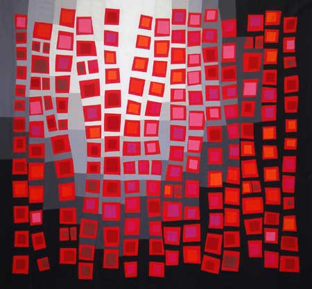
 July was a bust for me as far as getting much quilting done, but I’ve been diligently working on my next “push-up” for the last week or so. I’m a couple days late on my self-imposed deadline, but I’m finally done with Push-Up #3.
I was a bit mystified about where to begin with this new piece. In frustration, I decided to just sit down and start sewing strips together. I know black, white, and red is a favorite color scheme for many people, whether in home interiors, clothing, or quilts. It’s never been a color combination that I’ve been particularly fond of, but I thought I should make at least one quilt with those colors.
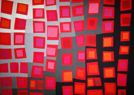
Naturally, I couldn’t leave it with just three colors. I also knew I wanted to play with another principle of color theory. This time I decided to play with the idea of “disappearing boundaries” and “dissolving boundaries.” Basically, “disappearing boundaries” is the idea that when two analogous of the same value are placed next to each other, the colors visually appear to blend. The closer the values, the greater the effect. “Dissolving boundaries” is a similar effect, but it involves a pure color and a muted version of it. To test these ideas, I decided to use pure red as my main color and combine it with red-orange, orange, red-violet, pink, and muted red.
 When you look at this close-up, you can see how these principles worked. In some cases, the central square practically disappears. In others, it remains clearly separated, but very low contrast.
Believe it or not, I’ve never made a Log Cabin quilt, even though it has always been a personal favorite of mine. As I started sewing my strips together, I fell into making little Log Cabin “seedlings” (just the central square with one row of strips on all sides). As my seedlings began to pile up, and I started slapping them up on my design wall in a rough grid pattern. The more I looked at it, the more I liked it so I decided to stop adding strips to my seedlings. Now I just needed to chose my background color. I wanted to use both black and white in this piece. I’m still fascinated with how colors look different on different backgrounds. The best solution I could think of was to add in some grays and gradate the background. I’m glad I did. I really like how it turned out (even if it’s not blue).
While I was sewing, I was also thinking about a title. I was thinking that this was my requisite red Log Cabin quilt (since every quilter should make at least one Log Cabin quilt, right?), but that was too many words. I like short titles. Two words are ideal. Kind of like a first name and last name, so I shortened it to Requisite Red.
Comments
12 responses to “Push-up 3: Requisite Red”
Maria that is a fantastic piece!!! And I love the name too. Did you dye the fabrics?
No, I’m lousy at dyeing fabric! These are all Kona cottons.
I love this…you were exploring a concept and have created a masterpiece…much stronger than setting out to create a masterpiece and ending up with nothing…what is the size (although it does not matter)…WOW…
–ed
It’s about 40″ x 45″ or so.
umm – LOVE IT!!!!!
Thanks! Especially considering other opinions 😉
Sweet hubby says it looks like those beaded curtains they used to hang in doorways in the 70’s
WOW … WOW… WOW!! I love it! What a great job and how exciting to be experimenting with all those concepts, it great!! I’m so impressed! ANd I think Nancy would be so proud!
What a great piece. I have only a basic knowledge of color theory but thank you for explaining some of the principles. It’s a great example. I think you succeeded very wqell with your piece.
Oh Maria it’s just divine! I was reading my feedly on my smartphone so the image popped up and I totally gasped! I had to open your blog on my workstation so I could see it all big. I’m stunned at the floating, dancing effect of those wonderful red boxes! Did you plan that? At first I thought you simply fused the red boxes onto the background fabric (until I opened the photo up larger) and I was like ‘OMG she totally pieced all that!!!
Well done, just really; well done!
Thanks, Stacy! No, I didn’t plan anything in advance other than the colors, but I was happy with the floating effect, too.
Oh my Maria-what fun it has been catching up with you! I love your dedication to studying color and what a beautiful piece. I agree that mu first words were WOW!