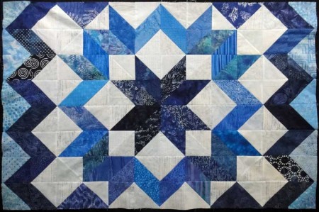
 I finished piecing together the blocks for the Cosmic Jewels quilt. (Its new name is “Sapphire Star.”) I did end up changing that one fabric that was bothering me along the right hand side. I decided to leave everything else as originally designed.
Next I’ll start digging around for some batting to use up. Since this will just be a wall quilt for my home and is not intended to be a show quilt, this might be a good time to use up some odd pieces left over from other quilts.
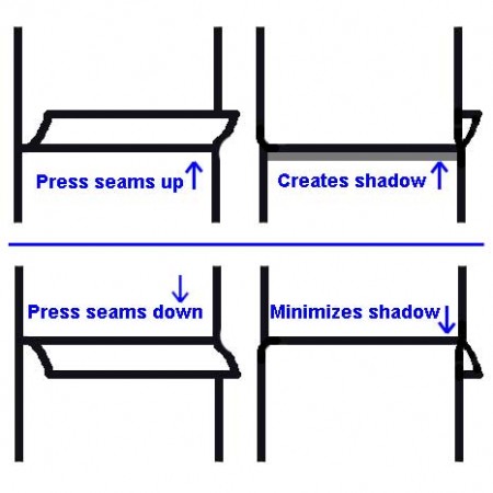
As I was pressing the quilt top, I had to decide whether to press the horizontal seams upwards or downwards. I had a theory that I wanted to experiment with. I thought that if I pressed the seams downwards so that the seam allowance was pointing towards the bottom of the quilt (when looking from the back side), the slight bump on the front side would cast less of a shadow.

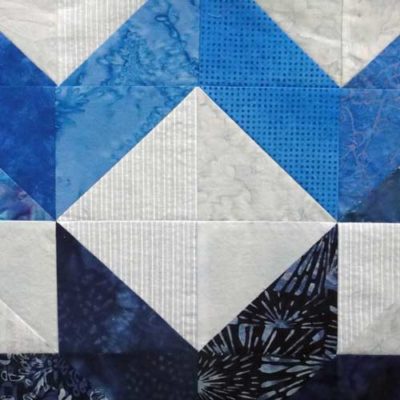
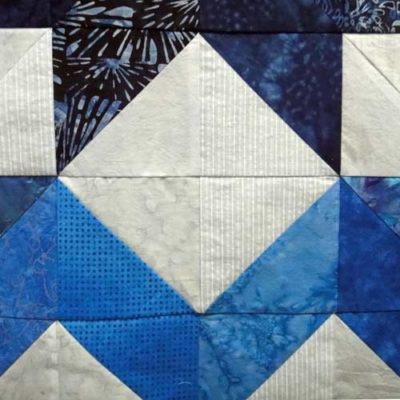
So, I pressed my seams downward, pinned up my quilt top, and took pictures. Then I turned the quilt top upside down and took more pictures. I kept all of the other factors the same: the lighting, the position, etc. Compare the horizontal seams in the two pictures. What do you think?
Granted, it isn’t quilted yet and I imagine that will make a difference somewhat. And does it really matter? I don’t know. It’s just the way my mind wanders…
August 17: I’m linking to Freshly Pieced: Work in Progress Wednesday.


Comments
14 responses to “Cosmic Jewels quilt top is complete!”
This is why I like you, Maria. : ) I’m not the only one who thinks of things like this and does little comparison experiments… Does it matter? Well, no, maybe not, but if you have a pure choice of pressing up vs. pressing down, and one way looks even a tiny bit better, why not take that choice? That said, most definitely, the one on the left has far less noticeable horizontal seams, which, especially in this design, is important to the impression of having sewn with whole diamonds, not partial triangles.
What a great looking quilt. I can’t tell the difference, but I do understand those shadows. Either way, it’s going to look great.
Ricci
I never would have thought of that but I can definitely see the shadow. Thanks for the tip!!
great job!! I’ve done that block and I find it tedious….but beautiful…and I do like your comparisons…
What’s great about the way Debbie Maddy taught it is that the top is made of half square triangles. There are no “Y” seams, so it is very easy to piece.
I would never have thought of that either. That’s a great tip.
It’s looking great, I love the range of blues you’ve used.
Beautiful quilt. I love the blues.
Beautiful!
I can definately see the difference in the shadows – this is something i’ll have to keep in mind. and your quilt top is beautiful 🙂
I’ve been busy working on mine…had to re-do one of the “directional” fabrics…the shadow effect is interesting…I have been pressing to make combining rows “easier” but paticularly with the white/light fabric I can see the benefit, particularly since your quilt will be on the wall (unless the only light sources are table lamps below the level of the quilty…wish I had been “brave” enough to change the size in addition to having changed my layout…
Beautiful quilt top! You could always press seams open instead of up or down – that way they are super flat and cast no shadow at all. Especially if the quilt top is already finished and you’re pressing your final seams. But it is lovely either way! Thanks for linking up to WIP Wednesday. : )
Good idea. And since this is a wall quilt, I’m not really interested in wear-and-tear issues.
You are featured on the C&T Publishing blog today – thanks for being a member of our Creative Troupe! http://www.ctpubblog.com
How fun! Thanks for letting me know!