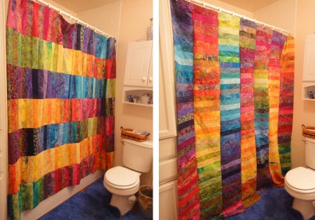
Here’s your chance to give your opinion on an earth-shattering decision: should the columns of color run horizontally (on the left) or vertically (on the right)? Once I decide, I plan on finishing this off tomorrow morning.

Here’s your chance to give your opinion on an earth-shattering decision: should the columns of color run horizontally (on the left) or vertically (on the right)? Once I decide, I plan on finishing this off tomorrow morning.
Comments
24 responses to “Horizontal or vertical?”
Ooh, I love it on the vertical. Gives a taller line. Gorgeous!
I have no substatntial reason for why, but I think horizontal looks better.
Horizontal is my vote. Called over Ryan, a 4 year old and he voted horizontal too.
Horizontal! 🙂
Both are great but my vote is vertical.
I think the horizontal looks better!
I like the horizontal too….the one one the left.
Definitely horizontal.
Count me as vertical.
My DH just cancelled me by voting horizontal. I guess you are on your own!
Jordan says horizontal… I second his opinion.
Horizontal!
Horizontal, Maria! In this version your wonderful red-blue, green-yellow-red, etc lines look straight even if the curtain is gathered. Also I really like the darker stripes at the top and the bottom! Very beautiful!!!
vertical don’t know why just think it looks better
It is terrific either way. Another thing to consider – does it help the room any either direction? Does the vertical give the room welcome height? Or is it happier getting the lengthening boost to the space?
Horizontal. Seems more unexpected and interesting, maybe more modern? Can’t wait to see the final result.
Vertical!
Horizontal!
Horizontal. And then my second vote is that you make me one! : )
Horizontal most definately.
I like the vertical! It gives more height to the room.
Horizontal. The strips still give it a vertical dimension. And I have a degree in Fine Art, so my vote counts more. … or not. : )
Horizontal!
Vertical!